Desk & tech / A closer look
Factory-Calibrated Monitors: What Color Accuracy Actually Means
A calibration report can be useful evidence. It is not a magic certificate that makes every photograph look right in every application.
Start here
The useful answer
As an Amazon Associate, we earn from qualifying purchases. How our links work ↗
The useful answer
Factory calibration describes a measured setup under particular conditions. Check the tested preset, color space and report method, then use appropriate color management. A wide-gamut monitor is most valuable when your workflow can handle the extra range correctly.
| Term | What it describes | What it does not prove |
|---|---|---|
| Gamut coverage | The range of colors relative to a target space | Accurate rendering of every color |
| Delta E | A color-difference result under a stated method | Identical results in every mode and application |
| Factory calibration | A setup and check before delivery | An unchanged display for its entire life |
| Display profile | A description used in a managed workflow | A guarantee that every application uses it correctly |
The phrase factory calibrated sounds reassuring. It suggests that somebody with the right equipment has already done the difficult work, leaving you free to open a photograph and trust what you see. Then you connect the monitor, open the same image in two applications and wonder why the colors still do not seem quite the same. Was the report meaningless, or is something else happening?
Usually the useful answer begins by separating several ideas that product pages place close together: resolution, gamut, calibration and color management. They are related, but they do not perform the same job. Understanding the distinction helps you buy a monitor for actual creative work without treating a certificate as a substitute for an appropriate workflow. This is an explanatory buying guide, not an independent measurement of a review unit.
Start with the output you need to make
Before choosing a monitor, name where your work ends up. A photograph for a website, a presentation viewed on ordinary office screens and a file prepared for a managed print workflow present different practical questions. The screen is one part of a chain. Buying a more capable screen does not tell the rest of that chain which colors you intended.
Write down the applications you use, the files you exchange and any requirements supplied by a client or printer. If those requirements are unclear, resolve them before paying for features whose value depends on them. A broad color range can be useful for one workflow and largely unused in another. The most expensive-looking monitor specification is not necessarily the one that removes your current uncertainty.
Gamut is a range, not a score for truthfulness
Think of gamut as the territory a display can cover relative to a defined color space. Accuracy asks a different question: when a particular color is requested, how closely does the displayed result match the intended target? A large territory can still be navigated badly. A smaller, well-controlled range can be more useful than a wider range used without the right settings.
This explains why “more colorful” is a poor synonym for “more accurate.” An image that looks dramatically saturated may be exciting without being faithful to the file’s intended appearance. If you edit that appearance until it looks restrained on your screen, the resulting file may behave unexpectedly elsewhere. The important task is to understand the target rather than to maximize visual punch in every situation.
A concrete example: the PA279CRV claim
ASUS specifies the ProArt PA279CRV as a 27-inch 4K IPS display with 99% DCI-P3 and 99% Adobe RGB coverage, Calman verification and factory calibration to Delta E below two. It also lists USB-C video with up to 96 W Power Delivery. These are manufacturer claims for the model, not measurements we have reproduced on a sample.
The useful buying question is how those capabilities connect to your work. A creator who can use the relevant color spaces and manage files appropriately has a reason to investigate. Someone who mainly writes documents should not assume that a wide gamut will make an ordinary spreadsheet more correct. The product may still offer other useful features, but color capability needs its own justification.
Delta E needs a sentence around the number
Delta E is a way of expressing color difference, but a headline figure is incomplete without the method and conditions. Ask which formula was used, what was measured, which preset was active and whether the result is an average or a maximum. Those details affect what a reported value can tell you. One small number is not a universal description of every possible output.
You do not need to reject a report because it is concise. You do need to resist expanding its scope beyond what it actually says. A measurement from one mode should not be carried into another mode as though nothing changed. A result for selected test patches does not mean that every pixel under every condition has been independently certified to look identical.
The report describes a state, not an eternal personality
A monitor is used in settings that can change. Brightness, preset, software settings and the surrounding environment all influence the viewing situation. A factory report can provide a valuable starting point, but it does not document every choice made after the display reaches your desk. That is why the phrase factory calibrated should begin a setup conversation rather than end it.
When the monitor arrives, keep the report and identify the mode to which it applies. Photograph or note the relevant settings before changing them. If you later need to investigate a discrepancy, this record helps you return to a known starting point. Randomly changing several controls while chasing a more pleasing image makes the original evidence harder to use, even if the monitor itself is working normally.
Calibration and profiling are connected, but different
In a practical workflow, calibration concerns bringing a display toward a chosen operating target. Profiling describes the resulting behavior so that compatible color-management systems can account for it. The exact tools and workflow vary, but the distinction is useful: setting something up and describing what it does are not the same action.
For deeper background, the International Color Consortium provides the standards context behind ICC-based color management. For your purchase, the immediate task is to check what the monitor and your software support. Do not assume that installing any file called a profile calibrates the physical display, or that a downloaded profile from another unit perfectly describes the one on your desk. Match the method to the question you need answered.
Why the same image can differ between applications
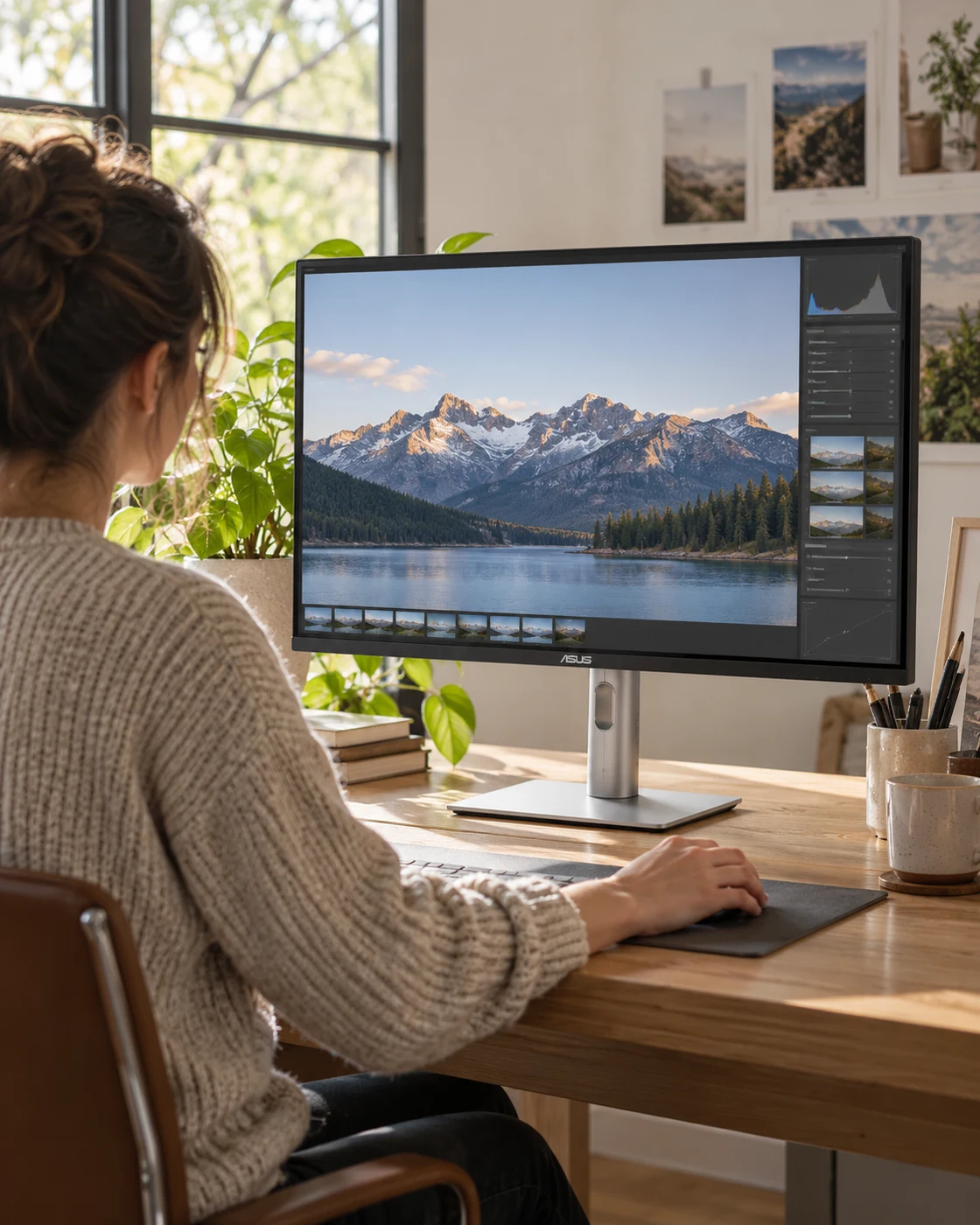
An application may handle embedded profiles, display profiles and viewing modes differently from another application. An export may also omit information that another viewer needs. When two views disagree, the display is only one possible cause. Replacing the monitor before checking the file and application settings can turn a workflow problem into an unnecessary hardware purchase.
Start with a known file and an application whose color handling you understand. Confirm the export settings and whether the image carries the intended profile. Compare like with like rather than mixing an edited preview, a browser thumbnail and a compressed messaging-app copy. The goal is to narrow the difference systematically. A monitor cannot repair inconsistent assumptions made before the image reaches the screen.
Wide gamut can make unmanaged content look unexpectedly vivid
If content is shown without the intended interpretation, a wider-capability display can reveal a mismatch rather than quietly hiding it. That does not mean the monitor is defective. It means the combination of file, application and display mode needs investigation. A more capable tool can make a weak workflow easier to notice.
If most of your output is intended for ordinary web viewing, investigate the monitor’s appropriate limited-gamut preset and the behavior of your applications. Do not choose the most saturated mode because it looks impressive in a store. Judge a working setup by whether it helps you make predictable decisions, not by whether every photograph looks more dramatic than it did on the screen you used before.
The room is part of the viewing situation
A screen beside a bright window is not experienced in the same way as one in a dim room. Reflections, wall colors and the relationship between screen brightness and the surroundings affect how you judge an image. A carefully measured display does not make those environmental differences disappear. This is why a studio-looking specification sheet cannot substitute for a workable desk position.
Consider where you will actually edit. Can you reduce strong reflections? Is the lighting reasonably consistent during the work that matters? Are you making adjustments while the room changes dramatically through the afternoon? You do not need to build an elaborate studio for every hobby project, but you should recognize when the environment is adding uncertainty that a new monitor alone will not remove.
Uniformity is another question, not an implied promise
Color accuracy at selected measurement points is not automatically a complete map of the screen. If your work depends on judging subtle tones across a large image, spatial consistency may matter. Look for measurements that address that question specifically rather than assuming a general calibration badge covers it. We have not mapped the uniformity of a PA279CRV sample.
For a new purchase, examine the display using normal material you understand, within the seller’s allowed return checks. If you see a concerning difference, document the mode and conditions and ask the manufacturer how to evaluate it. Avoid inventing a dramatic defect from a phone photograph alone. Camera exposure, viewing angle and room light can make a screen photograph misleading in either direction.
HDR is not a substitute for the rest of the workflow
HDR terminology adds another layer to monitor shopping. A supported format or certification should be read according to its actual scope, not treated as a blanket promise of a reference mastering experience. The ability to accept a signal is a different question from the complete visible result. Investigate the requirements of your intended work before assuming that an HDR badge settles the purchase.
If your daily work is primarily standard dynamic range, configure and judge that workflow first. Turning on every available enhancement can make a desktop look striking while making ordinary editing decisions harder to interpret. A useful display setup is the one appropriate to the task you are doing now. More modes are choices to manage, not instructions to enable them all simultaneously.
When a measuring device becomes worth considering
If your decisions have repeatable professional consequences, you may need a way to verify the display you actually use. That is a workflow decision rather than an automatic accessory sale. Investigate compatible measurement hardware and software, the targets you need and the level of checking appropriate to your work. The right method depends on the output, not simply on owning an expensive monitor.
For a hobbyist who mainly wants a more predictable starting point, the factory report and an appropriate setup may be enough to begin. Keep expectations proportional to the job. Do not buy a measuring device just to feel that the setup is complete if you have no plan for using it. Conversely, do not treat a one-time report as a substitute for verification when a client explicitly requires it.
A less specialized work monitor can be the better value
If your day is mostly text, calls and spreadsheets, a conventional office display may spend the budget more effectively. The Dell S2725DSM is a different kind of option in our collection: investigate its workspace, stand and connection requirements rather than treating it as an equivalent creative monitor. Different briefs deserve different shortlists.
This is not a judgment that one user is more serious than another. It is a way to avoid paying for unused capability while neglecting a practical need. A readable screen at the right height can improve a working setup more than a color-space feature you never deliberately use. Our work-monitor guide helps put the requirements in a sensible buying order.
A first-day checklist that leaves you with useful evidence
Confirm the exact model, native resolution and connection mode. Find the factory report and relevant preset, then keep a note of the starting settings. Set up a suitable working environment and check your main applications with a known file. If you make a change, record it and assess the result before changing something else. This creates a small but useful history of the setup.
If a discrepancy remains, describe it precisely: which application, which file, which mode and what comparison you are making. That is much more useful to support staff than saying the colors feel wrong. It also helps you distinguish a configuration problem from a purchase that does not meet your needs. Good evidence shortens the path to a sensible next step.
Share files, not assumptions about another person’s screen
Even a carefully arranged editing setup does not control the display used by a client or friend. If they report that a file looks different, begin by checking the actual exported file, intended profile and viewing application. Sending a phone photograph of your own monitor rarely resolves the technical question because it introduces another camera and another screen into the chain.
Agree on the delivery requirements before making repeated visual corrections to satisfy an unknown viewing setup. Keep the original and record which export was sent. That makes it possible to investigate a real difference instead of editing in circles. A good monitor supports a controlled part of the workflow; it cannot make every device at the other end behave identically.
Buy predictability, not a badge collection
A factory-calibrated monitor can be a strong starting point for work that benefits from controlled color. The report matters because it describes something specific, not because it removes every future question. The best purchase connects the display’s capabilities to a workflow you can explain and maintain. That is a more useful goal than collecting the largest number of impressive labels.
Use the PA279CRV card below if its creative brief matches yours, and compare the ordinary office route if it does not. Check the exact configuration and current offer before ordering. A monitor should help you make better decisions about the work on it. When the setup is understood, the most satisfying result may be that you spend less time thinking about the screen at all.
The questions worth asking
Before you decide.
Does wider gamut mean more accurate color?
No. Gamut describes range. Accuracy concerns how closely the output matches the intended target under defined conditions.
Is a factory report enough for paid color-critical work?
It is useful initial evidence, but your actual workflow, display state, verification needs and client requirements determine what further checking is appropriate.
Will calibration improve a low-resolution monitor’s text?
Calibration is not a resolution upgrade. Investigate resolution, scaling and signal quality separately.
Featured in this guide
The next good question
Keep exploring.
 Read the story ↗
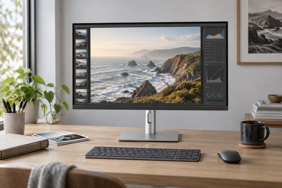
ASUS ProArt PA279CRV Review: Color Work Without a Crowded Desk
A calm workspace for image-making, with the color workflow left in.
 Read the story ↗
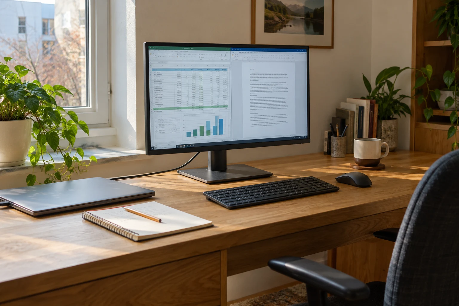
Best Monitors for Work and Gaming: 5 Picks by Use
An office screen, a USB-C creative-work option, a gaming-focused choice and compact alternatives. Start with the task that matters most.
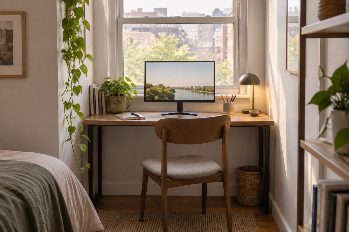 Read the story ↗
Best Monitors for Small Desks: A Space-First Buying Guide
For a compact desk, start with usable viewing distance and stand depth, then choose 24–27 inches based on resolution and eyesight. A slim 24-inch display is the safer fit for shallow worktops; a 27-inch QHD screen earns its footprint when you need more readable workspace. Measure before shopping, including the base, cables and keyboard zone.